This website uses cookies so that we can provide you with the best user experience possible. Cookie information is stored in your browser and performs functions such as recognising you when you return to our website and helping our team to understand which sections of the website you find most interesting and useful.
Email us at sales@brainnwave.ai
Or you can book a demo meeting straight into Simon's calendar with the link below:
Mosaic Smart Sector Intelligence: Where We’re At
Estimated reading time: 10 minutes, 48 seconds.
Our Smart Sector platform has been in development for some time now, and since we’re launching new features more regularly, it felt like a sensible time to take stock of our current features, and let you know what the platform can do.
Mosaic Smart Sectors allows you to see your economy as it is by uniquely classifying businesses based on how they describe themselves. This, plus additional business data and the ability to target businesses, is the core of what we offer, but let’s break that down into some of our favourite features.
Insights View
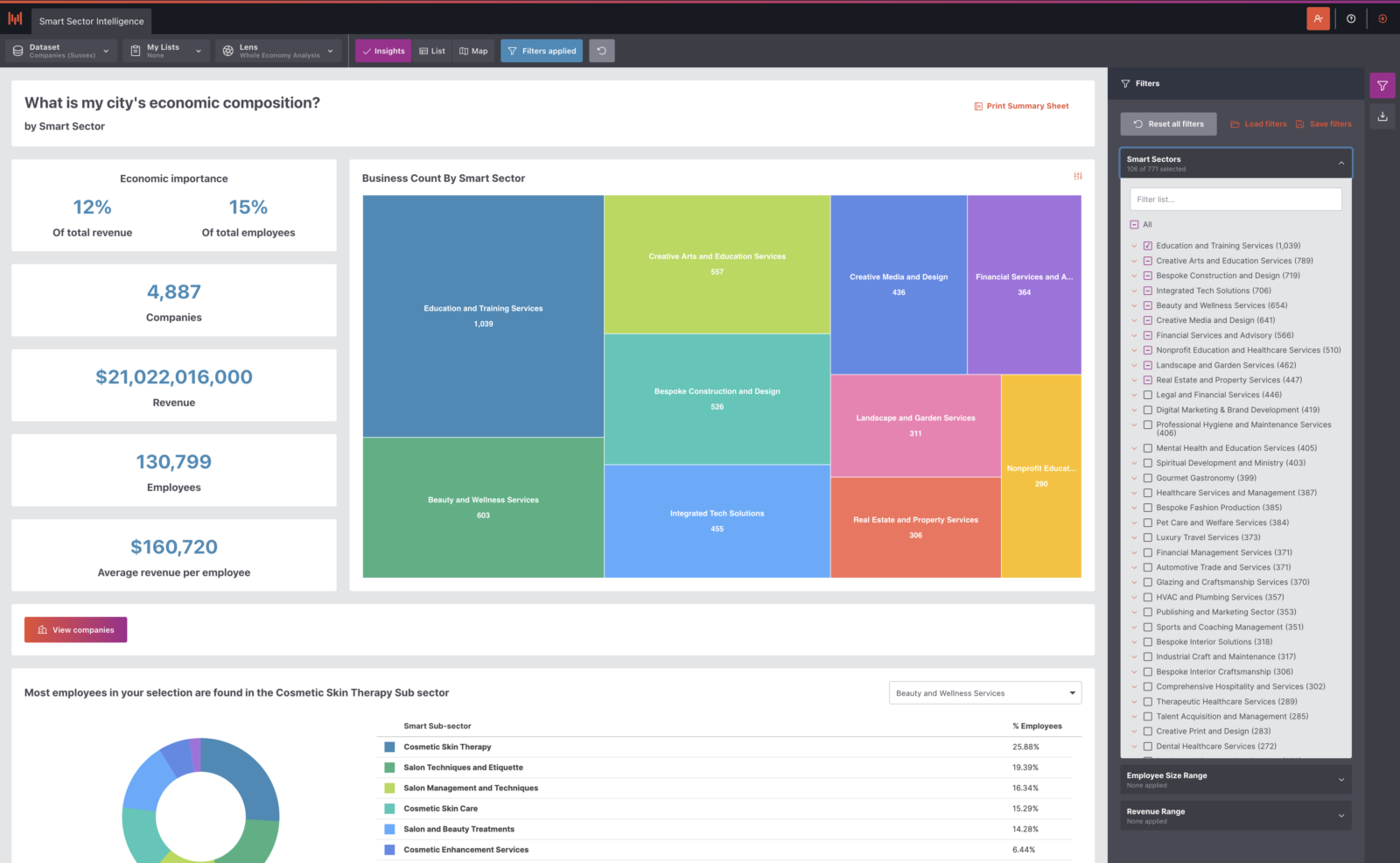
Our core view on your data is where we show a number of key stats, your smart sector breakdown, employee distribution and the Smart Sector X-Ray.
As with the Map and List views, this view on the data respects the filters chosen, so can display several things depending on how you’re filtering your data.
At the highest level, it’ll show you a snapshot of your area’s economic composition. First, there are key stats like number of businesses, revenue numbers, employees and average revenue per employee calculations.
Alongside these key stats, you’ll find a treemap showing the top ten Smart Sectors (which can be expanded to show more or less, depending on how many you’re interested in viewing).
Insights View: Why should you care?
The Insights View feature is designed to provide a comprehensive and customisable overview of your data, offering several benefits that are crucial for informed decision-making:
- Snapshot of Economic Composition: By providing a high-level overview of your area’s economic composition, you can quickly understand the landscape of your business environment. Key stats like the number of businesses, revenue numbers, employees, and average revenue per employee give you a clear picture of economic health and productivity.
- Smart Sector Breakdown: The treemap visualises the top ten Smart Sectors, allowing you to see which sectors are most significant in your area. This can help you identify growth opportunities, potential investment areas, and sectors that may require more support or regulation. This can also help you validate whether the sectors that you are promoting as your strongest economic drivers really are the ones you should be promoting.
- Customisable Filtering: The ability to filter data means you can tailor the view to your specific needs. Whether you need a broad overview or a detailed analysis of particular sectors, the Insights View adapts to provide the most relevant information for your requirements.
Treemap Options
One of the impressive things this treemap can do is show you top-level sectors and sub-sectors simultaneously. It can also be changed to show the breakdown of your area based on employee count or total revenue and as business count.
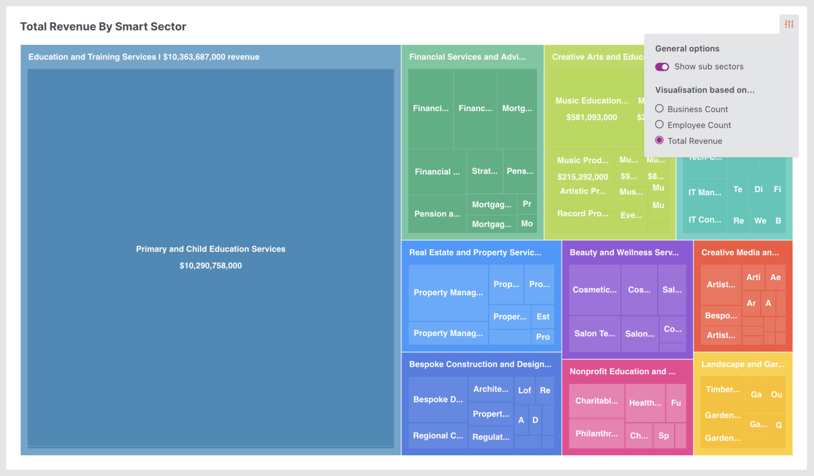
This means you can determine the sectors that are the biggest employers in your area, the sectors with the most businesses and the sectors bringing in the highest revenue.
Treemap Options: Why should you care?
The Treemap Options feature offers significant insights that can directly impact your strategic decision-making:
- By switching to Employee Count: Quickly identify which sectors are the main drivers of workforce employability. This allows you to focus on the industries that are creating the most jobs and potentially align your resources to support these high-employment sectors.
- By switching to Total Revenue: Instantly see which sectors are contributing the most to your GDP. Understanding which areas generate the highest revenue can help you prioritise investments and policy decisions to maximise economic growth and sustainability.
With these insights, you can make more informed decisions that align with your economic and business goals, ensuring a more effective allocation of resources and efforts.
Workforce Distribution
Below the treemap and key stats is a donut chart showing the employee distribution for your Smart Sectors. This allows you to select a Smart Sector and find out which sub-sectors contain the highest percentage of employees.
Workforce Distribution: Why should you care?
The Workforce Distribution feature offers critical insights into the employment landscape within your Smart Sectors:
- Visualise Employee Distribution: The donut chart provides a clear visual representation of how employees are distributed across different Smart Sectors. This helps you quickly identify which sectors are the largest employers and understand the workforce structure at a glance.
- Identify Key Sub-sectors: By selecting a Smart Sector, you can drill down to see which sub-sectors have the highest percentage of employees. This detailed view allows you to pinpoint specific areas that are driving employment, enabling more targeted workforce planning and development strategies.
- Optimise Resource Allocation: Understanding where the majority of employees are concentrated can help you allocate resources more effectively. Whether it’s training programs, recruitment efforts, or policy initiatives, you can focus on the sub-sectors that need the most support or have the greatest potential for growth.
Leveraging this feature ensures that you have a thorough understanding of your workforce distribution, allowing you to make data-driven decisions that enhance employment strategies and economic development.

At the bottom of the page, we also show the Smart Sector X-Ray, a Sankey chart mapping our Smart Sectors back to relevant industry codes.
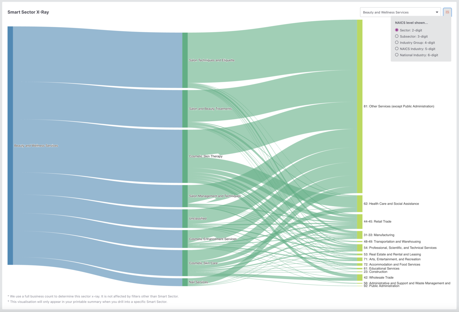
Not only can you map a selected Smart Sector to top level NAICS or SIC codes, but you can also change the mapping to any level of industry code you require.
You can very quickly see how complex some of the Smart Sectors can be and the complexity involved in compiling these sector definitions manually using outdated classification!
Sector X-Ray: Why should you care?
This visualisation provides transparency into the complexity of the AI models. It gives you confidence that our AI algorithms are diving deep into the details of what businesses actually offer and finding all the businesses, regardless of any official NAICS classifications, that cluster into the sector. This X-Ray also provides the secret key to unlock further economic analysis on how the sector is evolving over time.
Summary Sheets
Pair this Insights view with the ability to print out a summary sheet, and you have a quick reference at your fingertips for meetings, information requests, and sector reviews.
Summary Sheets: Why should you care?
The Summary Sheets feature enhances the usability and accessibility of your data insights, offering several practical benefits:
- Quick Reference for Meetings: Having a printed summary sheet provides a concise and clear reference during meetings. It ensures that you have all the key statistics and insights at your fingertips, facilitating more productive discussions and informed decision-making.
- Respond to Information Requests Efficiently: When you need to provide data to stakeholders, investors, or team members, summary sheets allow you to quickly generate and share essential information. This can streamline communication and improve transparency.
- Conduct Sector Reviews with Ease: Summary sheets offer a convenient way to review and analyse specific sectors. By pairing them with the Insights view, you can easily track changes, identify trends, and make data-driven assessments of sector performance.
Using the Summary Sheets feature ensures that you are always prepared with the necessary information, enhancing your ability to respond promptly and effectively in various professional scenarios.
List View
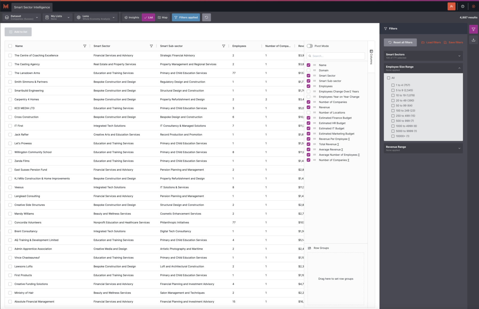
Alongside the Map and Insights views, we have a list view that might feel reasonably familiar to any spreadsheet users. This view is where you can see the full list of business data we have, and trigger the business detail pages to drill further into any of our business entities.
List View: Why should you care?
The List View feature provides a versatile and detailed way to manage and analyse your business data, with several key benefits:
- Familiar Interface for Spreadsheet Users: If you’re accustomed to working with spreadsheets, the List View offers a user-friendly interface that feels intuitive and easy to navigate. This familiarity can reduce the learning curve and increase productivity.
- Comprehensive Data Access: The List View allows you to see the full list of business data, giving you comprehensive access to all available information. This ensures you can perform detailed analyses and have all the data you need at your fingertips.
- Drill Down with Business Detail Pages: With the ability to trigger business detail pages, you can delve deeper into specific business entities. This feature provides in-depth insights into individual businesses, allowing for more targeted research and analysis.
- Advanced Analytical Tools: Built-in tools like “pivot mode” enable you to quickly and easily cut the data to see it the way you want. This flexibility allows you to perform complex data manipulations and gain unique insights tailored to your specific needs.
Utilising the List View feature ensures you have a powerful and flexible tool for managing and analysing your business data, making it easier to make informed decisions and uncover valuable insights.
Advanced Table Filtering
We were not content with having this view adhere to filters in the filter panel only, so we also built in more useful ways to filter each column by keywords. Containing, not containing, equalling, beginning with or ending with search terms provides a comprehensive way to filter the table results.
Advanced Table Filters: Why should you care?
The Advanced Table Filtering feature allows for precise and customizable data management by filtering each column with various criteria such as keywords, making data analysis more efficient and tailored to your needs. This enhances your ability to quickly find relevant information and make informed decisions, improving overall productivity and strategic planning.

Column Groups
Using the columns pull-out, you can also build your row groups based on metrics we have within the data.
Want to see the business rows grouped by Smart Sector? It’s easy – build a row group in seconds, and order as you wish.
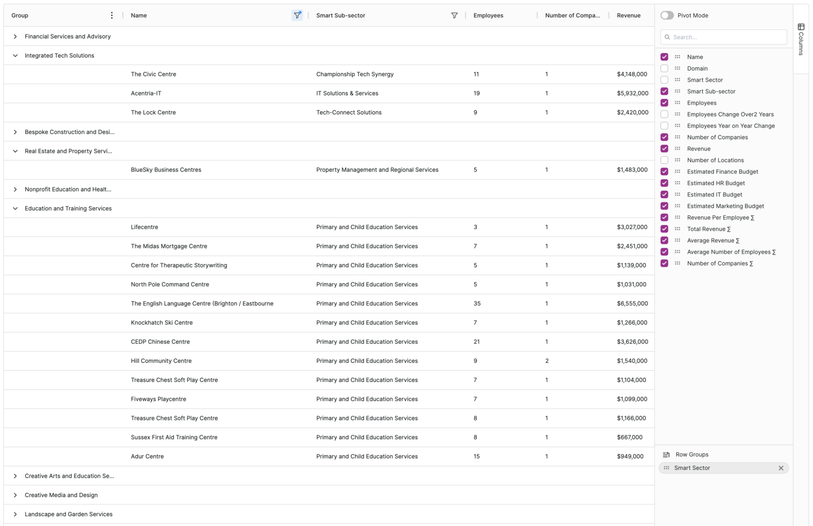
Feeling overwhelmed with this information? No problem. You can easily remove columns that don’t show the data you need, and add ones that do. You have the freed to reorder the columns as you wish, and filter and order them to perfectly suit your search.
Business Detail Pages
Open a business from map or list view and you can get a sense for just how much data we have in our platform.
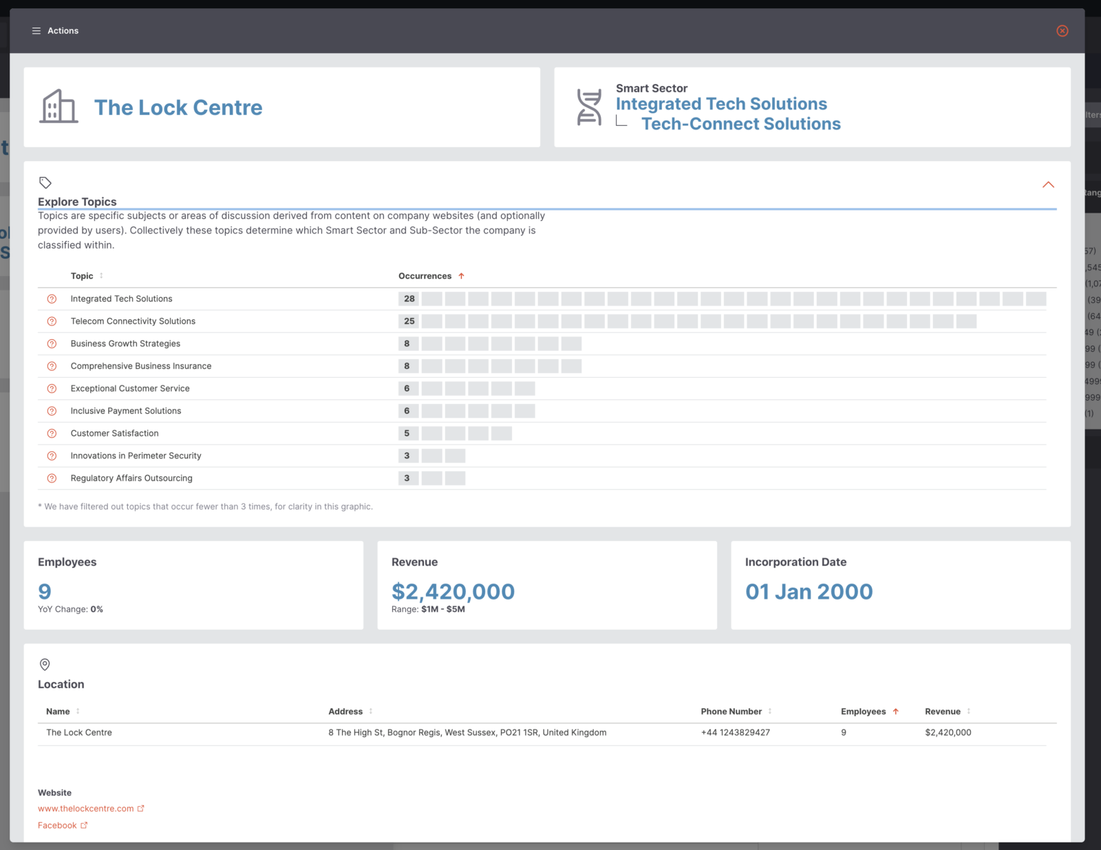
Alongside the business information you’d expect like name, locations employee numbers, and revenue, we also show the smart sectors they appear within and the topic breakdown so you can get a feel for how and why this business was categorised in the way it was.
Topic Breakdown: Why should you care?
Provides transparency into why a business has been classified under a specific smart sector, and hence can help identify mismatches quicker.
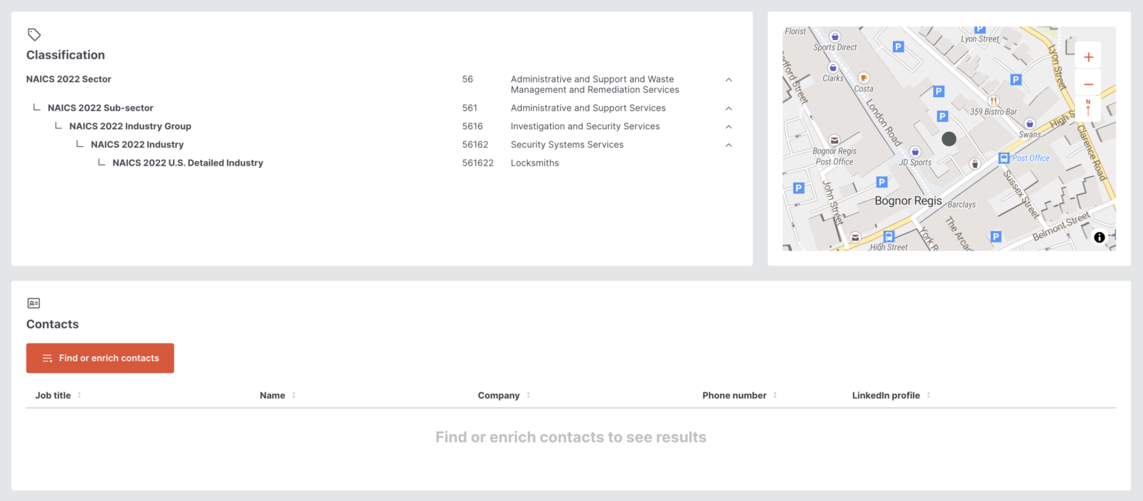
Drill into the NAICS or SIC codes to see how Smart Sectors interplay with industry codes, or jump into our contact enrichment section and start feeding your outreach campaigns.
Find or enhance existing contacts with a single click of a button and let our platform scurry off to collect relevant employee information based on relevant job titles and business names.
Businesses With Multiple Locations
Rather than count multiple locations or sites of the same business around your area, we merge these into a single view and display these together on a merged record to make things easier.
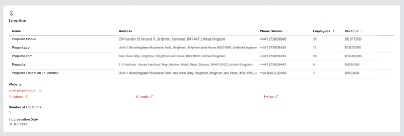
In addition to all this, we also allow summary sheets to be printed from business detail pages.
Multiple Locations: Why should you care?
You will see the overall “performance” of the businesses in your area but more importantly, you’ll also see the breakdown so you understand the stats at each location and can identify primary and secondary locations.
User Curated Lists
When you view the platform, you’re viewing a set of data – essentially everything we have on your area, as we defined together during the platform setup phase.
What happens if you want to start building your own subset of this data? Maybe you want to create a list of all businesses doing advanced agriculture, with 10 or fewer employees, making less than $500,000 revenue annually.
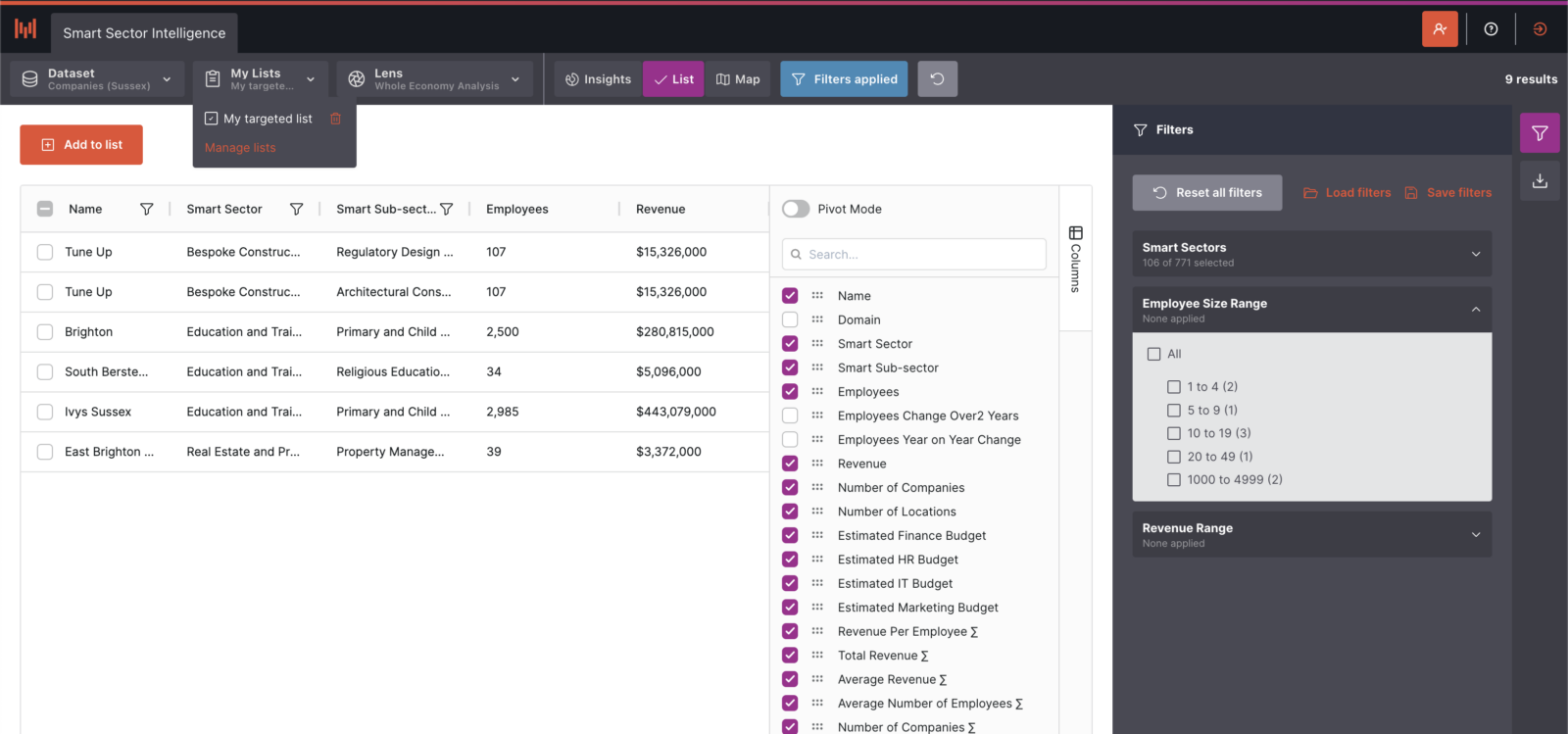
This is simple to filter to, but then take that a step further by selecting the relevant businesses, and adding them to a custom list!
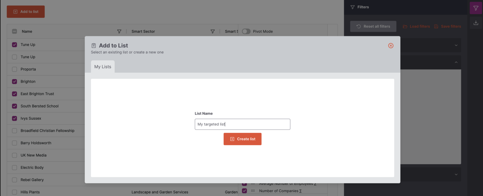
But it doesn’t stop there. You can take this list and filter even further, just as you would with the entire dataset. Use it as a checklist for outreach or communication. And the best part? You can create as many lists as you like for ultimate flexibility!
User Lists: Why should you care?
The User Curated Lists feature empowers you to create and manage custom subsets of data tailored to your specific needs. This allows you to easily organise and focus on particular groups, such as businesses with specific attributes, and use these lists for targeted outreach, communication, and detailed analysis. The ability to create unlimited lists offers unparalleled flexibility, enhancing your ability to strategise and act effectively based on curated data.
Ready To Jump In?
We’ve only just scratched the surface of what’s possible here. If you’re ready to jump into the platform and start understanding your local economy in a more flexible and rewarding way, get in touch with us today to arrange a demo. We’d be delighted to show you around!
